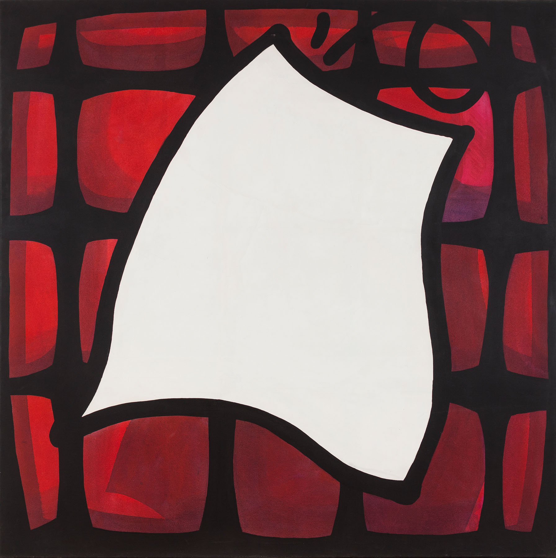
On Continuous Movement (1990), by Ernesto Ballesteros
Rafael Cippolini

It is clear to us that Ernesto Ballesteros plays with his own paradigms as well as his recurring elements – taking into account that components and references are permanently moving in his works – although his themes (his anchors) are almost always the same: a personal reversion of science applied to art, play and its uncertainties in front of the image, successive format changes, fascination with the process rather than the outcome, integration of colleagues to produce his pieces, sometimes only establishing rules, although generally in these cases he usually adds himself as another team member.
In an old website that has not been online for a long time (perhaps it will be restored, we do not know) he singled out two phases in his production (two tabs in the virtual site). The visitor could choose those ideas related to his projects from the 20th century, or the 21st century. In the minimal biography that complemented the images´ composition you could read (I quote by heart for obvious reasons): “Since 2000 I enjoy my work.” That said, the suspicion of the revision and reformulation of many of his topics is still valid.
From the age of nine, concurrently with his lessons at Labardén Vocational Institute of Art, he attended – as we read in one of his bios – Alberto Murillo´s painting workshop, which Alberto Bruzzone used to supervise. “[There] he received a guidance he continues to apply even today in his educational activity: drawing things from inside out, without edges.” It is no less true that he does not do so only in his pedagogical work.
This displacement from the inside out usually articulates his methods´ narrative, the chains of meaning and experience that take him from one work to another; his exceedingly singular changes of condition (and with this we return to the creative dynamics in his parameters).
In mid-July 2024, we exchanged WhatsApp audios trying to reconstruct the radical singularity of the painting that is now part of the collection. Although it shares the title with one of his early series, it is quite detached, both from its presumed source and from the rest of his production. I reconstruct the dialogue, focusing on the artist's voice.
Context and reversions. “As you say, it is a rare and unique work. In 1986, 1987, I had already been drawing a comic strip published in Fierro magazine, whose protagonist was named Vito Ver. Around that time I began to replicate the enlarged panels on canvas, a bit like paintings, but finishing off the image with a black stroke, rather comic-like. There was nothing but Vito Ver in those scenes, sometimes just the landscape without the character. I remember one with Vito Ver at a biplane´s commands on a low flight.”
Another presence. “Not long afterwards, I contacted Carlos Trilnik, who introduced me to video art. I started drawing pictures of Vito Ver and his girlfriend (Vito Verá, who was just like Vito Ver, but with long hair). I made the faces, and I began cropping, cutting and altering parts of the drawing, including the characters´ necks, legs, sneakers, which could not be seen as abstractions, but the viewer had to concentrate further to discover that ´this can be a heel, and that can be a leg´, etc. And I painted them as close as possible to the basic colors of television. I used blue for shadows, white for lights, and rough, thick lines on the edges to make the zoom, the crops evident. The lines were nearly ten centimeters wide, very thick.”
Evolution. “Then I did an installation at CAyC (Center for Art and Communication); it was basically points. I planted them with a Rotring pen and then I enlarged them a good deal. A point is an ideal thing, it does not exist morphologically as such; if it were perfect, it would be a circle, but it never is. So, there were little shapes that tended to be a point, but when you got closer, they looked like continents; I remember one that looked like Antarctica. I made forty-nine of those shapes, I still keep about forty-five. Those works were in primary colors.”
The series. “The exhibition Innocent Distractors at the Institute of Ibero-American Cooperation (ICI) was in that context, again with primary TV and video colors, fuchsia, blue, green. Then they represented the shape of Vito´s girlfriend´s lower back, an armchair´s capitonné, the side of a house and Vito Ver´s horizon; the house was an elongated stone, a very thin menhir. The title of the series that I presented on the event, El movimiento continuo [Continuous Movement], is related to the TV sets of the times, to the jets of light projected from the back of the device, that even when the image was still there was yet movement, those typical little dots. That is why all these works have that black rounded box, resembling old television monitors, some kind of square with a little curve.”
The exception. “Immediately after, I made a piece specifically for an award submittal. Size-wise, the measurements were determined by the terms and conditions, when I presented it. I guess I remember the prize was sponsored by Manliba, the garbage collecting company at Buenos Aires of those years, although I am not sure. Then I imagined a paper falling from the garbage collection and fleeing, that is why there are red cobblestones and the white paper as if floating in a counter-zenithal look.”
Conclusion: “It is a picture absolutely isolated from everything I had been working on.” That small piece of paper of continuous movement: so to speak, a unique piece.
